
Advice and inspiration
How do a rug's colour and pattern affect the atmosphere of a room?

A rug is one of the largest continuous colour fields in an interior. It can therefore change a room's atmosphere more decisively than a few cushions or small accessories: it may connect furniture into one group, warm a cool space, quieten emphatic architecture or become the principal visual focus.
There is no reliable universal equation in which “a light rug always makes a room larger” and “a red rug is always stimulating”. Perception arises from lightness, saturation, contrast, illumination, pattern scale, surrounding colours and personal experience together. The best selection therefore begins not with the name of a colour, but with a question: what job should the rug perform in this particular room?
First decide: main picture or quiet background?
A strongly drawn hand-knotted rug with a medallion, saturated field and contrasting border draws the eye down and creates a natural centre. It works best when the large surrounding surfaces remain calmer. A simple sofa, timber, matte plaster and restrained art give it room without turning the interior into an “Oriental” theme.
If colourful art, a statement sofa, veined stone or many books already dominate the room, a lower-contrast rug with a muted palette may work better. Its role is not to compete, but to connect the furniture's colours and form a calm common base beneath them.
Both approaches can feel rich. The distinction is not between “decorative” and “elegant”, but between different allocations of visual attention. A room is often more convincing when one knows which element leads and which elements support it.
Lightness affects airiness, but is not enough by itself
A light rug generally reflects more available light and can keep the floor field visually open. In a small or shaded room it will therefore often feel airier than a very dark continuous field. The result also depends on wall brightness, edge contrast, the quantity of furniture and the actual amount of light.
A dark rug does not automatically make a room look smaller. It can establish a firm base, articulate pale furniture and give a large room a sense of anchoring. If it is generously sized and its edge is not cut into many small fragments by furniture, it may actually unite the space.
A bright pale border around a dark field draws the rug's outline clearly. That can be desirable when defining a seating zone, but may make the floor feel more divided in a tight room. Softer transitions and lower edge contrast read more continuously.
Warm and cool hues change the perceived temperature
Rust, brick, ochre, burgundy and warm red commonly support a cosy, sociable impression. They can balance north light, a grey floor or stark white walls. They need not be loud: muted madder red and old gold supply warmth without high visual tension.
Blue, blue-green, sage and cooler greys are often perceived as calmer and fresher. In a sunny room they can visually cool warm timber and yellow daylight. In a dark room with cool light, however, a very grey blue may feel flat unless it is balanced with a warmer material or sufficient contrast.
Interior research indicates that hue can influence evaluations of pleasantness and arousal, but also finds a substantial role for individual preference. Do not choose a supposedly “psychologically correct” colour that you personally dislike. You will live with the rug every day.
Saturation determines how loudly the rug speaks
Highly saturated colours are visually energetic and gain attention quickly. They can animate a simple room, but over a large area and with strong contrast they can also increase visual complexity. Muted colours contain more grey, brown or natural variation and usually connect more easily with different timbers, fabrics and daylight conditions.
This does not mean a muted rug has to disappear. Differences between wool, silk details, pile direction and hand-spun yarn create depth within a limited palette. Conversely, a rug with a few saturated accents may feel more balanced than a field of one very intense colour.
Consider the proportion of colours, not just their list. A rug containing five per cent red will have a different atmosphere from one in which red fills the field, even if both contain the same hues.
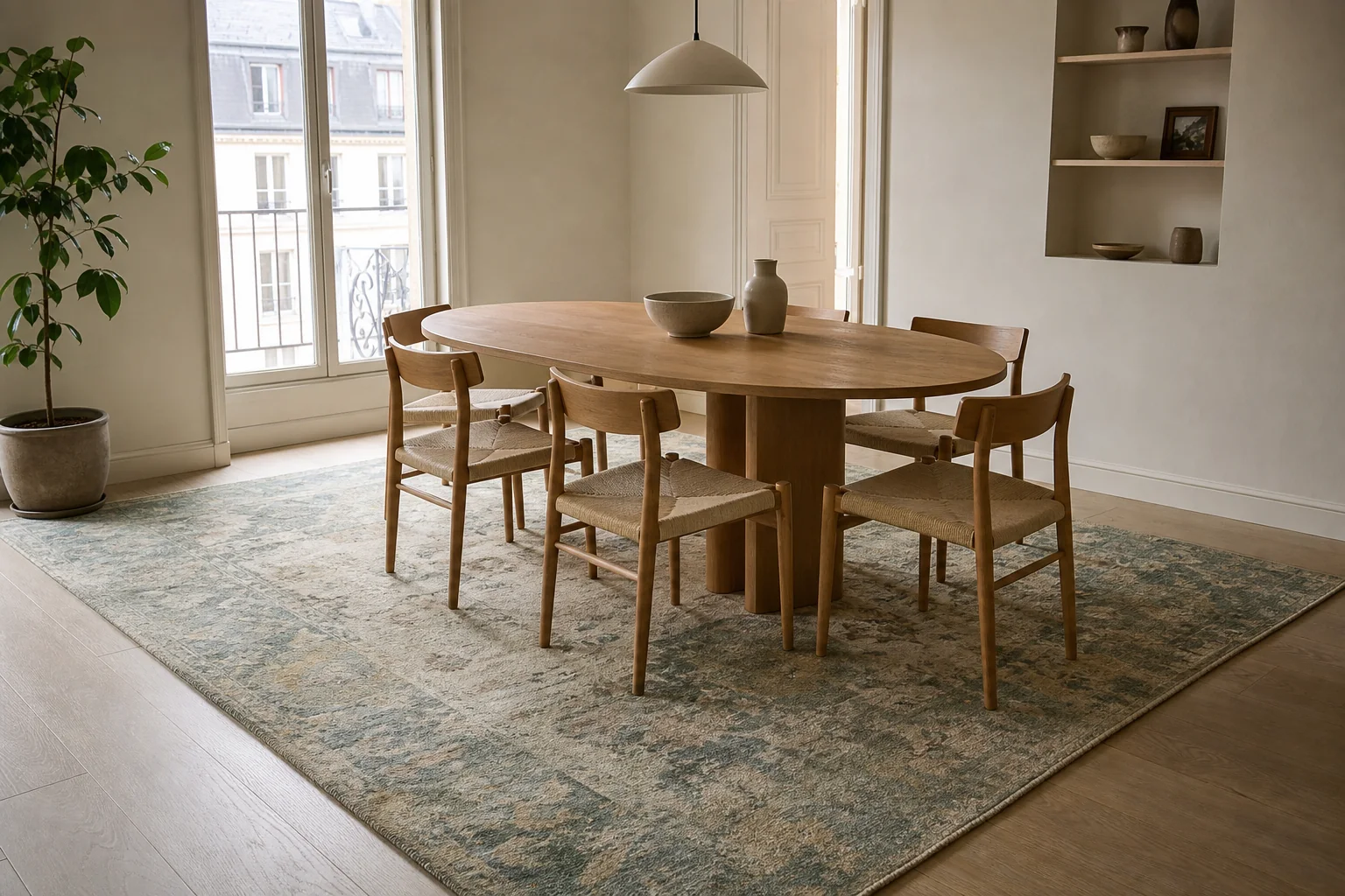
A muted palette need not vanish. A sufficiently large rug unites the dining group, while quiet pattern adds depth without competing with the furniture.
Pattern scale matters as much as colour
Large motifs read from farther away and can feel calmer because fewer repetitions occupy the visual field. They may look abstract on a small sample and acquire an entirely different rhythm when the rug is opened in a room. With a large rug, see a complete photograph or preferably the actual piece.
A small dense pattern adds texture and movement. Practically, it also makes every minor trace of use less conspicuous than a completely plain field. In a room already filled with narrow lines, shelving, blinds and small objects, however, another fine repetition can increase visual busyness.
Geometric pattern emphasises direction and can relate to architecture, floor joints and rectilinear furniture. Curving palmettes, medallions and plant forms soften strict lines. There is no need to repeat the exact motif on curtains and cushions; echoing its scale, curve or one colour note is often enough.
Contrast decides whether pattern advances or recedes
Two rugs with the same ornament can feel entirely different. When the difference between field and motif is large, the drawing reads from across the room and the rug becomes active. When the colours have similar lightness, the pattern emerges only at closer range and the whole appears quieter.
Strong contrast is not automatically disruptive. It may provide necessary structure in a minimalist interior. Difficulty arises when several large surfaces compete with equal intensity: a contrasting rug, emphatic wallpaper, a colourful sofa and several large pictures without a clear hierarchy.
A useful check is to view a room photograph in greyscale. Colour disappears, but the distribution of light and dark masses remains. It becomes easy to see whether the rug forms a quiet base or the strongest contrast in the room.
Daylight, lamps and pile direction change the colour
Screen colour is not fixed reality. North daylight, warm evening lamps and direct southern sun alter the relationships between hues. Red can warm in the evening, blue can become greyer and a pale cream may pick up colour reflected from the walls and floor.
In a pile rug, light also reflects differently with and against the lay. The field can appear deeper and darker from one end and paler from the other. Silk and fine wool strengthen this effect. View the rug from both directions and in the orientation in which it will lie.
Ideally see the rug in the room in morning, afternoon and ordinary evening light. If that is not possible, bring unfiltered photographs and samples of fixed materials — timber, upholstery or stone — to the showroom. Even then, remember that a display changes colour.
Size and placement often influence atmosphere more than hue
An undersized rug creates an island beneath the coffee table and visually separates the sofa from the chairs. A properly sized piece connects the seating group, so the room feels more composed whether its design is emphatic or quiet.
- Living room: at least the front legs of the principal seating should stand on the rug; with furniture floating in the room, placing every piece fully on it may work better.
- Dining room: the rug must extend far enough beyond the table for the rear chair legs to remain on one level when pulled out. A practical allowance is often about 75 to 90 cm on every side.
- Bedroom: the rug should remain visible and comfortable at the sides and foot of the bed, rather than being almost entirely concealed.
- Hall: leave an even floor border around a runner and check door clearance and edge safety.
In an open plan, colour or pattern can define functions without a partition. A dining zone may use quieter drawing and a sitting area a stronger field, while a common hue or similar saturation keeps the whole from becoming fragmented.
Combining a rug with furniture and art
Do not try to repeat every rug colour exactly. Select one quiet note for a larger surface and one small accent for a cushion, ceramic object or picture. Exact matches can feel arranged; related but non-identical colour creates more natural layering.
When combining two patterns, change their scale. A large rug motif can work with a fine stripe, while a small rug design can tolerate a larger abstract picture. One shared colour helps, but it is even more important that the patterns do not have equal density and contrast.
An old Persian or Caucasian rug does not require historic furniture. Contrast with a simple contemporary sofa or table often reveals its material and handwork more clearly than literal stylistic imitation.
A quick selection by desired atmosphere
| Aim | What often works | What to verify in the room |
|---|---|---|
| Calm and airy | Lower contrast, pale to mid-light field and generous motifs | Available daylight and contrast with the floor |
| Warm and cosy | Rust, ochre, burgundy, warm wool and a mid-to-dark tone | Whether evening light makes the colour too orange |
| Fresh and restful | Muted blue, blue-green, sage and natural neutrals | Whether north light feels too cool |
| A strong room centre | Legible medallion, higher contrast and a saturated principal colour | Calmer large surfaces and adequate rug size |
| Practical family room | Mid-tone multicolour drawing and a firm lower pile | Traffic, cleaning, children, pets and appropriate underlay |
How to test a rug before buying
- Measure the furniture group and mark the proposed outline with low-tack tape.
- Decide whether the rug is to lead the room or simply connect it.
- View the complete pattern, not only a small detail or corner.
- Compare it with the room's fixed materials and photographs taken in daylight and evening light.
- Look from both pile directions and from the height at which you will normally see it.
- Step back to the doorway: the first view often reveals hierarchy better than close examination.
- Consider traffic, maintenance and underlay as seriously as colour.
The most common mistake is choosing a rug as an isolated picture. A colour that seems dark in a showroom may come alive in a sunny room; a fine design seen close up may nearly disappear from a distance, while a beautiful small piece can divide the entire furniture group through scale alone.
A well-chosen rug need not match precisely. It should create a relationship between floor, furniture, light and the way the room is used. At the Carpeteria showroom in Prague 5, you can compare saturation, motif scale and colour changes with pile direction on actual rugs. Bring photographs and dimensions of the space — we can help you assess the whole rather than one isolated shade.